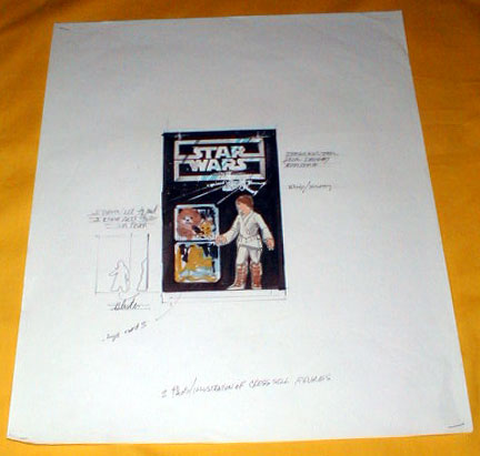


| Concept Sketch for 12-Back Blister Card | |
| Kenner had an outside design firm aid them in the creation of their Star Wars blister cards. The images you see on this page show a sketch dating from the earlier stages of this design process. As you can see, it features a rectangular version of the Star Wars logo, one which looks quite a bit different from the one that was used on the finalized package. However, it is rendered in the familiar faux steel color, and though it doesn't include the silver "race tracks" wrapping around the outside perimeter of the card, the outside letters of the words do extend out into the box which encompasses the logo. I think you can imagine how this idea was extended to encompass the entire card.
Here's a closer view. The image of Luke, based on the conceptual model of the figure seen here, is supposed to represent the action figure as it would appear on the card, not a printed image.
A still closer view. Those two squares to the left of the figure area represent images that were meant to be printed on the card. As you might be able to tell, the one on the top contains a rough sketch of Han Solo and Chewbacca. I'm not sure what the lower photo is meant to show, but I think it's probably intended to be a photo of yet another character in the figure line.
This next image shows a hand-written note that appears on the sketch. It specifies the two squares mentioned above as being intended to help cross-sell other figures in the line. Oddly enough, this idea, had it been ok'd, would have placed on the front of the 12-back cards images of characters other than the ones packaged on them. Thankfully, Kenner restricted its cross-selling tactics to the backs of their cards, where, as we all know, images of all the available figures were always present. Below this note is a thumbnail sketch of the proposed blister bubble, shown in what I believe are profile and head-on views. If I'm reading this correctly, the bubble wasn't conceived as being a standardized rectangle at this point, but was instead envisioned as conforming to the profile of the figure. Pretty weird.
Finally we have a second note, this one referring to the silver areas of the card having a "stainless steel look." |
| Description by: | Ron Salvatore |
| Photo: | Ron Salvatore |
| From the collection of: | Todd Chamberlain |
| Country: | United States |
| Film: | A New Hope |
| Licensee: | Kenner |
| Year: | 1977 |
| Category: | Prototypes / Product Concepts |