

| Hoth Turret Defense Mock-Up Box | |
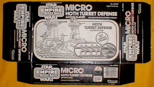
| This is a conceptual mock-up for the package to the Micro Collection Hoth Turret Defense playset. Basically, the item consists of a generic black box onto which various black-and-white elements have been applied.
Here you see a close-up of the proposed main image. It's more-or-less just like the one used on the final production item. The main difference is in the placement of the two turrets: on the production box, they were moved to the right and the cannon were rotated slightly. But more interesting is the change in Micro box construction that this mock-up reveals. Here, in the conceptual phases of the design process, it is evident that Kenner planned to release their Micro toys in regular rectangular boxes. But they eventually changed their minds and gave their smaller Micro packages (hich included everything but the Millennium Falcon and the three large "Worlds") a thin flap extending off their tops, a move which allowed them to clear up space for the graphics on the box fronts. Consequently, the inset visible in the lower right of the prototype box, which was intended to showcase the various figures included in the set, was moved to the flap (a smaller round inset was also added to the upper left of the production boxes). Of course, it's interesting to note that the figures on the mock-up box are all represented by the original Micro Collection test figure, the alternate sculpting of Luke that was the first metal Micro figure returned to Kenner from their production vendor. What this means is that no other metal figures were available at the time to display on this prototype. The Luke had to suffice.
Here's the reverse side of the piece. Although it looks quite a bit different from what was eventually produced, the design concept is similar to that applied to the finished product. To the right are thumbnails showing the Turret Defense set in different play modes. To the left are spaces which, although they are left blank here, are intended to showcase the other Micro playsets. The ad for the "Build Your Armies" mail-away set is not present here, either. It should also be noted that the Micro Collection logo that is used on this piece is not like the final one used on the production toys. On the released Micro Collection sets, no ESB logo appeared. Rather, it was replaced by a Micro Collection logo that closely resembled the familiar ESB tag. But on this prototype both the ESB logo and an early version of the Micro Collection logo appear side-by-side.
This is just a close-up of the thumbnails on the reverse of the package.
Now, this photo shows a second mock-up box for this playset. Unlike the first one seen on this page, it has no graphics on its back. In my opinion, it was made solely to present how the front of the package would appear with a different Micro Collection logo; so graphics on the reverse were not necessary. The ESB logo seen on the other mock-up was moved from the left of the package to the center, and a different Micro logo was placed, diagonally oriented, in the upper left corner. Simply put, Kenner was still messing around with their Micro logo at the time these pieces were made, trying to make it look just right.
Finally, a close-up of this logo. All in all, this piece provides an intriguing look into the conceptual phases of Micro Collection package design. |
| Description by: | Ron Salvatore |
| Photo: | Ron Salvatore |
| From the collection of: | Chris Georgoulias |
| Country: | United States |
| Film: | Empire Strikes Back |
| Licensee: | Kenner |
| Year: | 1980 |
| Category: | Prototypes / Micro Collection |